Charts
Certain collections contain charts.
The author of a collection might build a number of charts to make it simpler to access and make sense of the series inside.
Go back on the collection's landing page xr/daily and click on the tab Charts.
You can see three dashboards: americas, asia-pac et emea. Click on asia-pac.
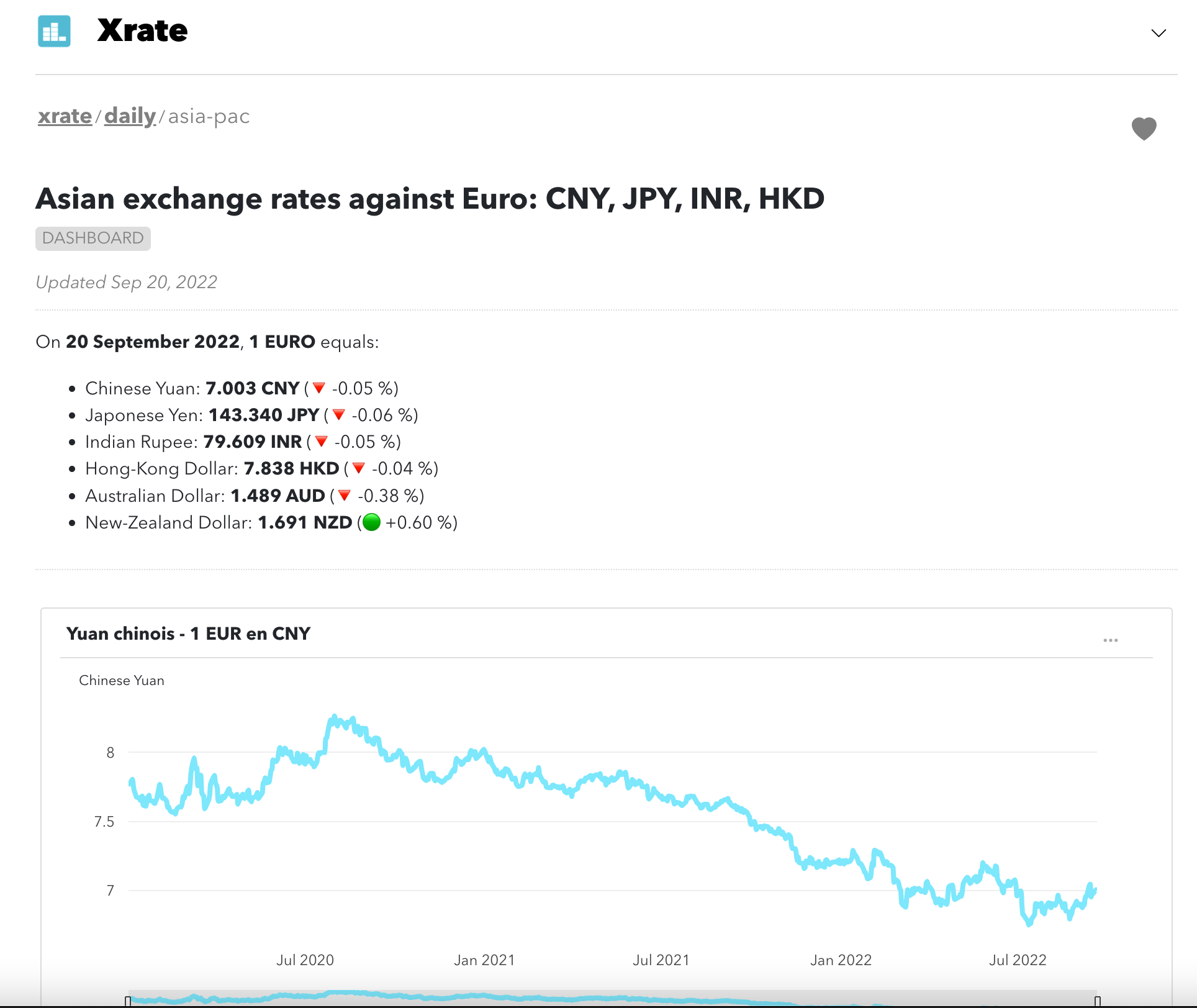
The dashboard
The dashboard starts with a summary followed by multiple charts.
On this dashboard, you will see a summary of Asian currencies exchange rates evolutions against the Euro and most exchange rate charts.
This dashboard is updated daily by Statit.
The chart
On the top right of each chart, you can click on the 'three dots' icon to download the chart (image or values). You will need to have an account for that (sign-up here).
At the bottom of the chart, you can click on "Sources" to visualise the series used to build the chart. You can click on each serie to see the original data.
Finally, you can add this chart to a "personal" dashboard. We will cover this in the next section.
Next steps
Nice, we have accessed a dashboard and a chart in the xr/daily collection.
We will now explain how to create an account.